An Adventure in X-theme Customizations
Are you new to using WordPress? Maybe this is your first project using X-theme by Themeco. Or maybe you have used X-theme before, but need to make new customizations. If this is you then please stick with us and we will walk you through all of the customizations we made to our most recent project.
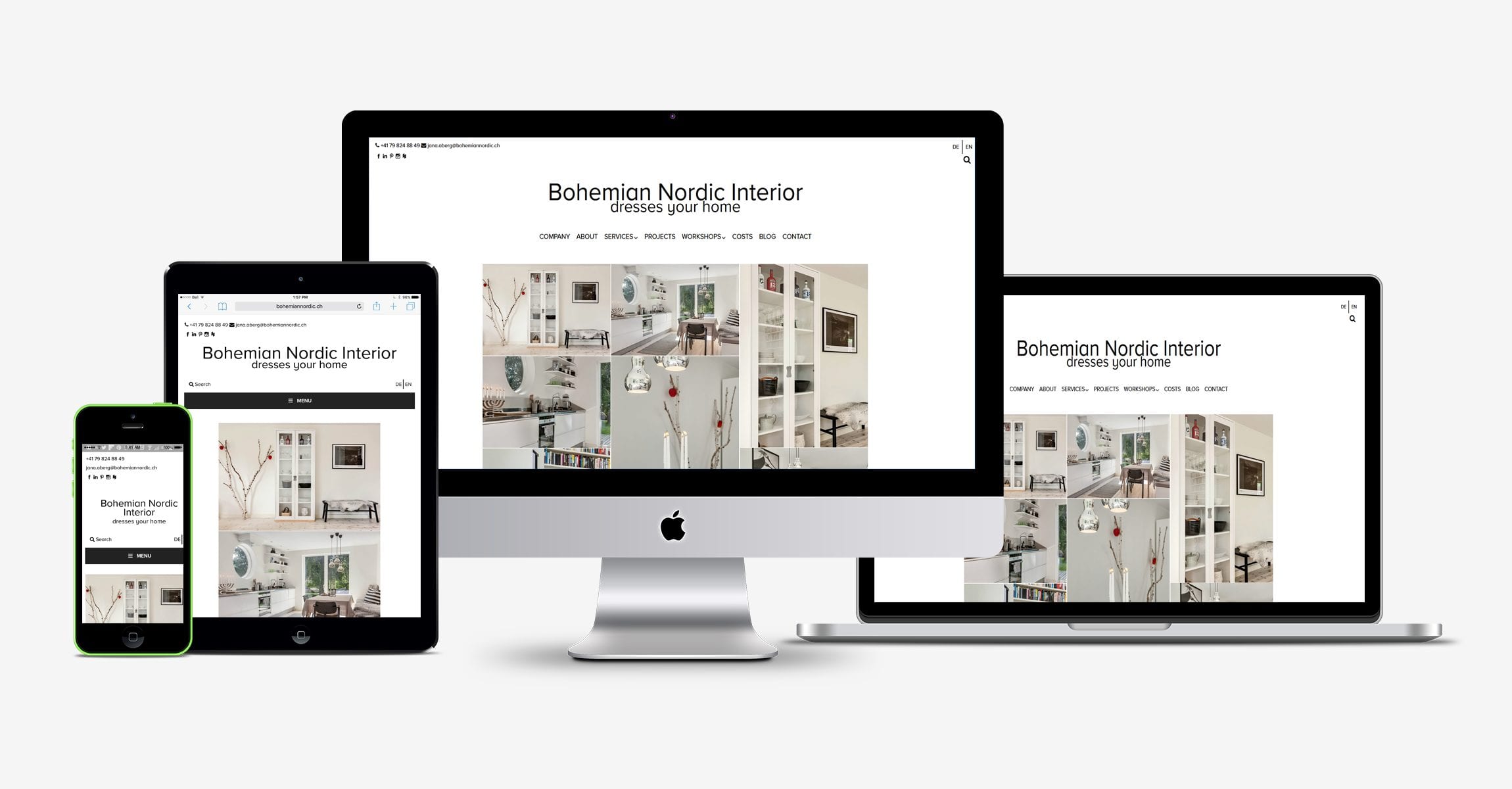
Our most recent project bohemiannordic.ch had several customizations.
- We had to integrate a language selector and ensure that we had translations that took included the slugs, search form overlay as well as our site’s meta description tags and titles.
- We had to add 4 custom widget areas and assign them to appropriate screen sizes
- We had to use custom fonts
- We had to add a site tagline to the text logo
- We needed to create a custom layout for multiple screen sizes that incorporated our other customization (widgets, etc)
Responsive design is great, it really has changed the way many of us need to think about designing our sites. BNI was our first project using X-theme and I can tell you, it won’t be the last. I have used many themes over the last few years, but so far X-theme has to be one of my favorites. On the surface, it is very lightweight and is very customizable. Personally, I would love to be able to have a little more flexibility with some of the choices, but hey anything is possible with a little code right? In our case, the client wanted to have their contact information and social media icons on one side with the language selector on the other. This meant we needed to add two custom widget areas to the header that aligned side by side below the topbar. In order to achieve this effect, first we added the following code to our child themes functions.php file:
register_sidebar(array(
‘name’ => ‘Custom Widget Left’,
‘id’ => ‘custom-widget-1’,
‘description’ => ‘Custom Widget Left’,
‘before_widget’ => ‘<div id=”custom-widget-1″>’,
‘after_widget’ => ‘</div>’,
‘before_title’ => ‘<h2>’,
‘after_title’ => ‘</h2>’,
));register_sidebar(array(
‘name’ => ‘Custom Widget Right’,
‘id’ => ‘custom-widget-2’,
‘description’ => ‘Custom widget Right’,
‘before_widget’ => ‘<div id=”custom-widget-2″>’,
‘after_widget’ => ‘</div>’,
‘before_title’ => ‘<h2>’,
‘after_title’ => ‘</h2>’,
));
Once we added the code, we needed to modify the copy the parent themes /views/renew/wp_header.php and paste it into the child theme’s corresponding directory. We achieved this by inserting the following code starting at line 18
<div class =”custom-widget-left”>
<?php if ( !function_exists(‘dynamic_sidebar’) || !dynamic_sidebar(‘custom-widget-1’) ) : ?>
<?php endif; ?>
</div>
<div class =”custom-widget-right”>
<?php if ( !function_exists(‘dynamic_sidebar’) || !dynamic_sidebar(‘custom-widget-2’) ) : ?>
<?php endif; ?>
</div>
</div>
Once we created the custom widget areas, we needed to populate them and style them. It wasn’t long before we recognized that we would also have to reconfigure the layout for mobile view. Using a combination of built in X-theme shortcodes and custom media queries, we were able to arrive at the desired look we were going for. After adding 2 more additional widget areas to the functions.php file (same process as before, but make sure you name them accordingly before inserting the appropriately named functions into the the view/global/_nav_primary.php file, which was copied into the child theme from the parent).
We then made the following css customization through the “customize/ edit global css tab” in the WordPress customizer:
General site-wide customization:
/*Custom widget areas, widgets and menu css*/
.custom-widgets .x-container.max.width {
width: 100%;
max-width: 100%;
list-style: none;
background-color: #fff;
}
.custom-widget-left {
width: 85%;
max-width:500px;
display: block;
float: left;
padding-left: 10px;
text-align:left;
font-size: 12px;
color: #000000;
}
.custom-widget-right {
text-align: right;
font-size: 12px;
padding-top: 15px;
}
.mobile-widget-areas .x-container.max.width {
width: 100%;
max-width: 100%;
display: block;
padding: 5px;
list-style: none;
background-color: #fff;
font-size: 12px;
}
.mobile-widget-areas .x-container.max.width a:link {
color:#000000;
}
.mobile-widget-areas .x-container.max.width a:hover {
color: #787878;
}
.mobile-widget-areas .x-container.max.width a:active {
color:#787878;
}
/*mobile search area*/
.mobile-search-area {
width: 50%;
float: left;
margin 0 0 0 0;
text-align:left;
font-size: 12px;
padding-left: 10px;
padding-bottom: 35x;
color: #000000;
}
/*mobile language selector*/
#mobile-widget-area {
height: 10px;
color:#000000;
background-color: #fff;
list-style: none;
}
#mobile-widget-area {
display: block;
text-align: right;
padding-bottom: 35px;
}
#mobile-widget-area ul {
margin: 0 0 0 0;
text-align: right;
color:#000000;
}
#mobile-widget-area ul li {
display: inline;
list-style-type: none;
margin: 0 0 0 0;
color:#000000;
opacity: 1;
-o-transition: 1s ease opacity;
-moz-transition: 1s ease opacity;
-webkit-transition: 1s ease opacity;
transition: 1s ease opacity;
}
#mobile-widget-area ul li.active {
opacity: 0.8;
}
#mobile-widget-area ul li:hover {
opacity: 1;
}
#mobile-widget-area img {
box-shadow: none;
vertical-align: middle;
display: initial;
}
#mobile-widget-area li+li {
padding: 5px;
border-left: 2px solid #000000;
}/*footer CSS customizations*/
.x-colophon .top {
background-color: #fff;
}
.x-colophon.bottom .x-colophon-content {
background-color: #fff;
}
.x-colophon.bottom .x-colophon-content {
font-size: 12px;
}
For desktop screens (defined as minimum of 1120px using @media queries):
/*hide mobile widgets*/
#mobile-widget-area {
display: none;
line-height: 20px
}
#mobile-search-area {
display: none;
line-height: 20px;
}
For tablet (defined as 650px to 800px wide):
.custom-widgets .x-container.max.width {
width: 100%;
max-width: 100%;
padding: 10px;
list-style: none;
background-color: #fff;
}
.custom-widget-left {
width: 85%;
max-width: 500px;
padding-left: 10px;
display: block;
float: left;
margin: 10px 0 0 0;
text-align:left;
font-size: 12px;
color: #000000;
}
.custom-widget-right {
position: relative;
top: -20px;
float: right;
margin: 0 0 -15px 0;
text-align: right;
}
#custom-widget-2 {
Display: none;
}
.x-logobar-inner {
padding-top: 25px;
padding-bottom: 25px;
}
.mobile-widget-areas .x-container.max.width a:active {
color:#787878;
}
/*mobile search area*/
.mobile-search-area {
width: 50%;
float: left;
margin 0 0 0 0;
text-align:left;
font-size: 16px;
padding-left: 10px;
padding-bottom: 35x;
color: #000000;
}
And for mobile (defined in our case as less than 650px wide):
.custom-widget-left {
width: 100%;
max-width: 400px;
padding-left: 2px;
font-size: 8px;
}.custom-widget-right {
Display: none
}
In order to achieve the desired look for the language selector, we created a custom horizontal menu and styled it as indicated above. We also needed to translate the search form overlay so that visitors would not get English messages when they were viewing the site in German. We did this by adding the following code to the functions.php file:
<?php
if ( ! function_exists( ‘x_navbar_searchform_overlay’ ) ) :
function x_navbar_searchform_overlay() {if ( x_get_option( ‘x_header_search_enable’, ” ) == ‘1’ ) :
?>
<div id =”custom-searchform-overlay”>
<div class=”x-searchform-overlay”>
<div class=”x-searchform-overlay-inner”>
<div class=”x-container-fluid max width”>
<form method=”get” id=”searchform” class=”form-search center-text” action=”<?php echo esc_url( home_url( ‘/’ ) ); ?>”>
<label for=”s” class=”cfc-h-tx tt-upper”>
<?php if(function_exists(‘qtrans_getLanguage’)) { ?>
<?php if (qtrans_getLanguage()==”en”): ?>
<?php echo “TYPE AND PRESS ‘ENTER’ TO SEARCH” ?>
<?php endif; ?>
<?php if (qtrans_getLanguage()==”de”): ?>
<?php echo “TYPE UND DRUCKEN SIE ‘ENTER’ ZU SUCHEN” ?>
<?php endif; ?>
<?php } ?></label>
<input type=”text” id=”s” class=”search-query cfc-h-tx center-text tt-upper” name=”s”>
</form>
</div>
</div>
</div>
</div>
<?phpendif;
}
add_action( ‘x_before_site_end’, ‘x_navbar_searchform_overlay’ );
endif;?>
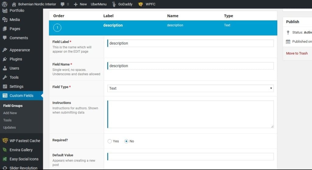
We used the ACF plugin to customize the language specific meta description tags and added the following to functions.php:
//meta tag function
<?php
function _set_meta_tag()
{//global $nome;
//global $descr;
//global $file;
//global $path_meta;$output .= ‘<meta property=”author” content=”https://plus.google.com/104573429015560904949″ />’;
if(get_field(‘description’)){
$output .= ‘<meta property=”description” content=”‘.get_field(‘description’).'” />’;
}else {
$output .= ‘<meta property=”description” content=”‘.get_bloginfo(‘description’).'” />’;
}if(get_field(‘keywords’)){
$output .= ‘<meta property=”keywords” content=”‘.get_field(‘keywords’).'” />’;
}else {
$output .= ‘<meta property=”keywords” content=”‘.get_bloginfo(‘name’).'” />’;
}echo $output;
}
add_action(‘wp_head’, ‘_set_meta_tag’);
?>
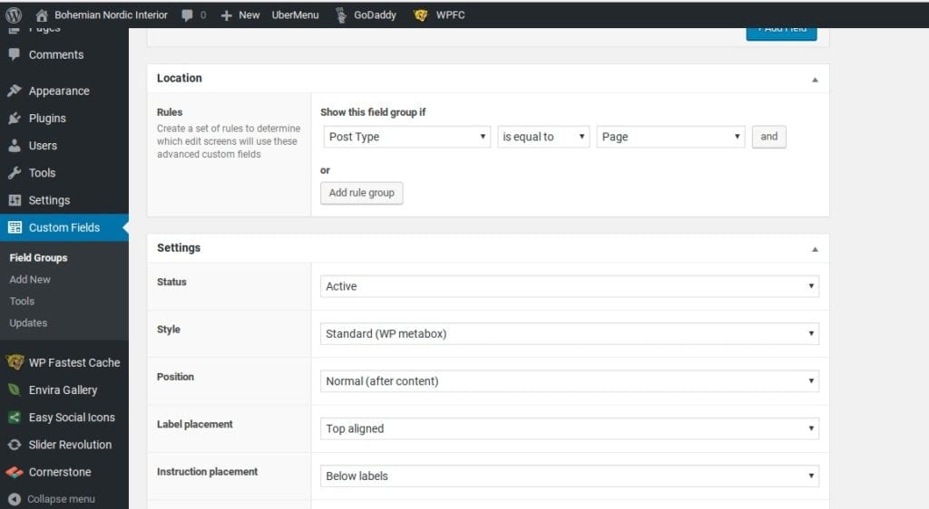
Equally important were the custom fields we created within the plugin. As shown below:


At the end of the day, a company’s website is about sharing information with potential customers as well as communicating brand identity. One of the ways to do this is to prominently display the company logo.
In the case of BNI being an Interior Design company, appearance is quite literally one of the top considerations. This means the logo, the font choice, image quality are all critically important.
As mentioned above, we used a custom font. We toyed with a few different options to display the font and settled on using Adobe Typekit . We installed the plugin, added the relevant code to the document header and then assigned the font using the X-theme customizer.
We then adjusted the font-size and line-height for the title, tagline and nav menus via @media queries and amended the views/global/brand.php file (after copying it from the parent theme to the child of course) to create two new anchor text classes as you can see here:
<a class=”bnisitebrand” href= “http://e61.a10.myftpupload.com/”>Bohemian Nordic Interior</a></br><a class=”bnisitetagline” href=”http://e61.a10.myftpupload.com/”>dresses your home</a>
Lastly, I want to caution readers that if you are planning on using Qtranslate X (like we did), do not expect to be able to use a page builder like X-theme’s cornerstone or Visual Bakery’s Visual Composer.
Personally, I liked the added challenge of working on the page customization manually, but for those of us who are familiar with page builders, or that have time as a major factor, Qtranslate X may or may not be the right fit for your project.
Having said that, if you have the patience to work through its peculiarities and have access to people who are able to translate your message into multiple languages, Qtranslate X is a terrific low-cost open source option (I suggest donating to the project).
On that note, I wish you all the best with your own X-theme customization and as Hal Johnson and Joanne McLeod used to say “ until next time, keep fit and have fun!”


Generally I don’t learn post on blogs, but I would like
to say that this write-up very compelled me to try and do so!
Your writing style has been amazed me. Thank you, quite
nice post.
Thanks for the support Maggi, Clearly I don’t reply very often either, we have been very busy this year so far. Busy is good but we (mostly I) been slacking on our posts!