by Michaela Sharp | Jun 7, 2017 | Blog, Digital, Marketing, Media Planning, Web
The slowly shaping path of content access and our digital devices
Have you ever wondered if there is a difference in what content you are accessing from which device? As a marketer, this is a fascinating question. And it turns out, we were not the only one’s asking. Recently, a study was done in the United Kingdom. Interestingly, it covered the connection between device type usage and content and may start to answer this question.
Does the device we are using influence what we read?
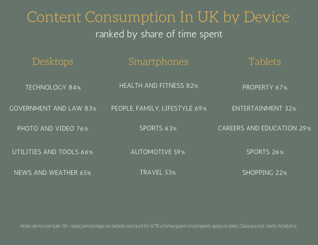
According to Verto Analytics, a company specializing in analytics and data research, there are some clear indications of how and what we read on our devices. Verto tracked devices of approximately 5,000 people in March of this year.
What they came up is very interesting. Apparently smart phones are frequently used for sports, health and fitness, automotive and travel. Addtionally, they are also used for people/family/lifestyle, which would includes recipes, food or parenting. By comparison, we use desktops for browsing on technology sites, government and law, news and weather or photo and video. Lastly, the tablet devices are mainly used for property, entertainment, careers, education, sports and lastly shopping.
Things are not always as they seem
As you can see, it is not always black and white in digital. Not all brands need to advertise on cross platform devices. However, some activities such as entertainment remains as multi-device content. People are accessing information from their tablets 32%, smartphones usage is up to 39% and desktops contributed 29% in this mix.
According to a recent eMarketer article, Verto’s data is very similar to the ComScore data that was released in December 2016. Which is enough to say there is a pattern. As advertisers, it is important to learn from findings like these, when planning our next digital campaign.


by Grant Sharp | Oct 19, 2016 | Blog, Web, xtheme tips and tricks
An Adventure in X-theme Customizations
Are you new to using WordPress? Maybe this is your first project using X-theme by Themeco. Or maybe you have used X-theme before, but need to make new customizations. If this is you then please stick with us and we will walk you through all of the customizations we made to our most recent project.
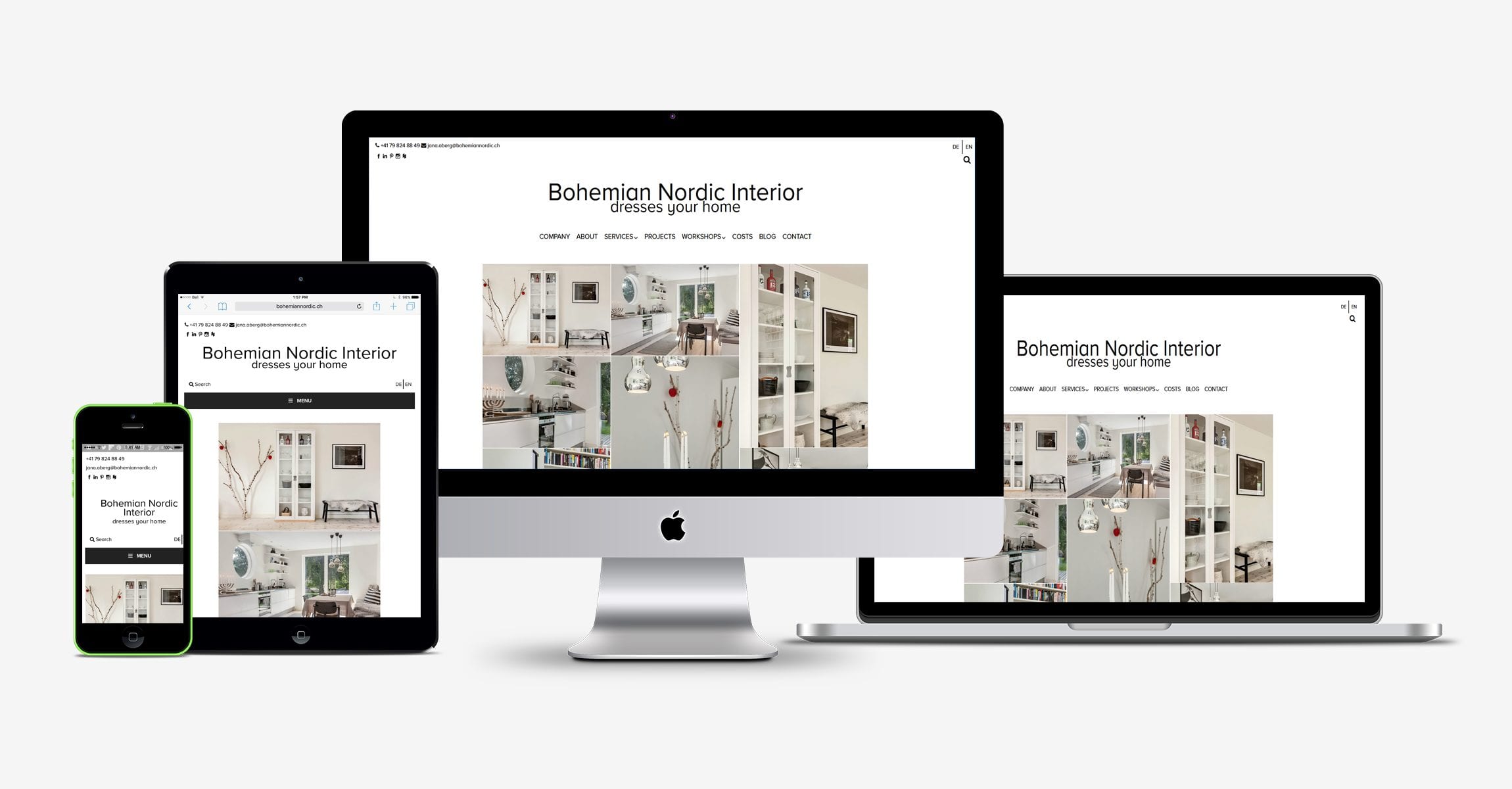
Our most recent project bohemiannordic.ch had several customizations.
- We had to integrate a language selector and ensure that we had translations that took included the slugs, search form overlay as well as our site’s meta description tags and titles.
- We had to add 4 custom widget areas and assign them to appropriate screen sizes
- We had to use custom fonts
- We had to add a site tagline to the text logo
- We needed to create a custom layout for multiple screen sizes that incorporated our other customization (widgets, etc)
Responsive design is great, it really has changed the way many of us need to think about designing our sites. BNI was our first project using X-theme and I can tell you, it won’t be the last. I have used many themes over the last few years, but so far X-theme has to be one of my favorites. On the surface, it is very lightweight and is very customizable. Personally, I would love to be able to have a little more flexibility with some of the choices, but hey anything is possible with a little code right? In our case, the client wanted to have their contact information and social media icons on one side with the language selector on the other. This meant we needed to add two custom widget areas to the header that aligned side by side below the topbar. In order to achieve this effect, first we added the following code to our child themes functions.php file:
register_sidebar(array(
‘name’ => ‘Custom Widget Left’,
‘id’ => ‘custom-widget-1’,
‘description’ => ‘Custom Widget Left’,
‘before_widget’ => ‘<div id=”custom-widget-1″>’,
‘after_widget’ => ‘</div>’,
‘before_title’ => ‘<h2>’,
‘after_title’ => ‘</h2>’,
));
register_sidebar(array(
‘name’ => ‘Custom Widget Right’,
‘id’ => ‘custom-widget-2’,
‘description’ => ‘Custom widget Right’,
‘before_widget’ => ‘<div id=”custom-widget-2″>’,
‘after_widget’ => ‘</div>’,
‘before_title’ => ‘<h2>’,
‘after_title’ => ‘</h2>’,
));
Once we added the code, we needed to modify the copy the parent themes /views/renew/wp_header.php and paste it into the child theme’s corresponding directory. We achieved this by inserting the following code starting at line 18
<div class =”custom-widget-left”>
<?php if ( !function_exists(‘dynamic_sidebar’) || !dynamic_sidebar(‘custom-widget-1’) ) : ?>
<?php endif; ?>
</div>
<div class =”custom-widget-right”>
<?php if ( !function_exists(‘dynamic_sidebar’) || !dynamic_sidebar(‘custom-widget-2’) ) : ?>
<?php endif; ?>
</div>
</div>
Once we created the custom widget areas, we needed to populate them and style them. It wasn’t long before we recognized that we would also have to reconfigure the layout for mobile view. Using a combination of built in X-theme shortcodes and custom media queries, we were able to arrive at the desired look we were going for. After adding 2 more additional widget areas to the functions.php file (same process as before, but make sure you name them accordingly before inserting the appropriately named functions into the the view/global/_nav_primary.php file, which was copied into the child theme from the parent).
We then made the following css customization through the “customize/ edit global css tab” in the WordPress customizer:
General site-wide customization:
/*Custom widget areas, widgets and menu css*/
.custom-widgets .x-container.max.width {
width: 100%;
max-width: 100%;
list-style: none;
background-color: #fff;
}
.custom-widget-left {
width: 85%;
max-width:500px;
display: block;
float: left;
padding-left: 10px;
text-align:left;
font-size: 12px;
color: #000000;
}
.custom-widget-right {
text-align: right;
font-size: 12px;
padding-top: 15px;
}
.mobile-widget-areas .x-container.max.width {
width: 100%;
max-width: 100%;
display: block;
padding: 5px;
list-style: none;
background-color: #fff;
font-size: 12px;
}
.mobile-widget-areas .x-container.max.width a:link {
color:#000000;
}
.mobile-widget-areas .x-container.max.width a:hover {
color: #787878;
}
.mobile-widget-areas .x-container.max.width a:active {
color:#787878;
}
/*mobile search area*/
.mobile-search-area {
width: 50%;
float: left;
margin 0 0 0 0;
text-align:left;
font-size: 12px;
padding-left: 10px;
padding-bottom: 35x;
color: #000000;
}
/*mobile language selector*/
#mobile-widget-area {
height: 10px;
color:#000000;
background-color: #fff;
list-style: none;
}
#mobile-widget-area {
display: block;
text-align: right;
padding-bottom: 35px;
}
#mobile-widget-area ul {
margin: 0 0 0 0;
text-align: right;
color:#000000;
}
#mobile-widget-area ul li {
display: inline;
list-style-type: none;
margin: 0 0 0 0;
color:#000000;
opacity: 1;
-o-transition: 1s ease opacity;
-moz-transition: 1s ease opacity;
-webkit-transition: 1s ease opacity;
transition: 1s ease opacity;
}
#mobile-widget-area ul li.active {
opacity: 0.8;
}
#mobile-widget-area ul li:hover {
opacity: 1;
}
#mobile-widget-area img {
box-shadow: none;
vertical-align: middle;
display: initial;
}
#mobile-widget-area li+li {
padding: 5px;
border-left: 2px solid #000000;
}
/*footer CSS customizations*/
.x-colophon .top {
background-color: #fff;
}
.x-colophon.bottom .x-colophon-content {
background-color: #fff;
}
.x-colophon.bottom .x-colophon-content {
font-size: 12px;
}
For desktop screens (defined as minimum of 1120px using @media queries):
/*hide mobile widgets*/
#mobile-widget-area {
display: none;
line-height: 20px
}
#mobile-search-area {
display: none;
line-height: 20px;
}
For tablet (defined as 650px to 800px wide):
.custom-widgets .x-container.max.width {
width: 100%;
max-width: 100%;
padding: 10px;
list-style: none;
background-color: #fff;
}
.custom-widget-left {
width: 85%;
max-width: 500px;
padding-left: 10px;
display: block;
float: left;
margin: 10px 0 0 0;
text-align:left;
font-size: 12px;
color: #000000;
}
.custom-widget-right {
position: relative;
top: -20px;
float: right;
margin: 0 0 -15px 0;
text-align: right;
}
#custom-widget-2 {
Display: none;
}
.x-logobar-inner {
padding-top: 25px;
padding-bottom: 25px;
}
.mobile-widget-areas .x-container.max.width a:active {
color:#787878;
}
/*mobile search area*/
.mobile-search-area {
width: 50%;
float: left;
margin 0 0 0 0;
text-align:left;
font-size: 16px;
padding-left: 10px;
padding-bottom: 35x;
color: #000000;
}
And for mobile (defined in our case as less than 650px wide):
.custom-widget-left {
width: 100%;
max-width: 400px;
padding-left: 2px;
font-size: 8px;
}
.custom-widget-right {
Display: none
}
In order to achieve the desired look for the language selector, we created a custom horizontal menu and styled it as indicated above. We also needed to translate the search form overlay so that visitors would not get English messages when they were viewing the site in German. We did this by adding the following code to the functions.php file:
<?php
if ( ! function_exists( ‘x_navbar_searchform_overlay’ ) ) :
function x_navbar_searchform_overlay() {
if ( x_get_option( ‘x_header_search_enable’, ” ) == ‘1’ ) :
?>
<div id =”custom-searchform-overlay”>
<div class=”x-searchform-overlay”>
<div class=”x-searchform-overlay-inner”>
<div class=”x-container-fluid max width”>
<form method=”get” id=”searchform” class=”form-search center-text” action=”<?php echo esc_url( home_url( ‘/’ ) ); ?>”>
<label for=”s” class=”cfc-h-tx tt-upper”>
<?php if(function_exists(‘qtrans_getLanguage’)) { ?>
<?php if (qtrans_getLanguage()==”en”): ?>
<?php echo “TYPE AND PRESS ‘ENTER’ TO SEARCH” ?>
<?php endif; ?>
<?php if (qtrans_getLanguage()==”de”): ?>
<?php echo “TYPE UND DRUCKEN SIE ‘ENTER’ ZU SUCHEN” ?>
<?php endif; ?>
<?php } ?></label>
<input type=”text” id=”s” class=”search-query cfc-h-tx center-text tt-upper” name=”s”>
</form>
</div>
</div>
</div>
</div>
<?php
endif;
}
add_action( ‘x_before_site_end’, ‘x_navbar_searchform_overlay’ );
endif;
?>
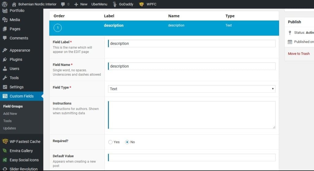
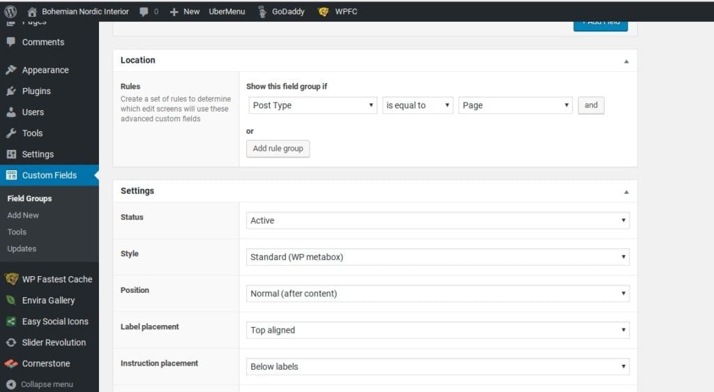
We used the ACF plugin to customize the language specific meta description tags and added the following to functions.php:
//meta tag function
<?php
function _set_meta_tag()
{
//global $nome;
//global $descr;
//global $file;
//global $path_meta;
$output .= ‘<meta property=”author” content=”https://plus.google.com/104573429015560904949″ />’;
if(get_field(‘description’)){
$output .= ‘<meta property=”description” content=”‘.get_field(‘description’).'” />’;
}else {
$output .= ‘<meta property=”description” content=”‘.get_bloginfo(‘description’).'” />’;
}
if(get_field(‘keywords’)){
$output .= ‘<meta property=”keywords” content=”‘.get_field(‘keywords’).'” />’;
}else {
$output .= ‘<meta property=”keywords” content=”‘.get_bloginfo(‘name’).'” />’;
}
echo $output;
}
add_action(‘wp_head’, ‘_set_meta_tag’);
?>
Equally important were the custom fields we created within the plugin. As shown below:


At the end of the day, a company’s website is about sharing information with potential customers as well as communicating brand identity. One of the ways to do this is to prominently display the company logo.
In the case of BNI being an Interior Design company, appearance is quite literally one of the top considerations. This means the logo, the font choice, image quality are all critically important.
As mentioned above, we used a custom font. We toyed with a few different options to display the font and settled on using Adobe Typekit . We installed the plugin, added the relevant code to the document header and then assigned the font using the X-theme customizer.
We then adjusted the font-size and line-height for the title, tagline and nav menus via @media queries and amended the views/global/brand.php file (after copying it from the parent theme to the child of course) to create two new anchor text classes as you can see here:
<a class=”bnisitebrand” href= “http://e61.a10.myftpupload.com/”>Bohemian Nordic Interior</a></br><a class=”bnisitetagline” href=”http://e61.a10.myftpupload.com/”>dresses your home</a>
Lastly, I want to caution readers that if you are planning on using Qtranslate X (like we did), do not expect to be able to use a page builder like X-theme’s cornerstone or Visual Bakery’s Visual Composer.
Personally, I liked the added challenge of working on the page customization manually, but for those of us who are familiar with page builders, or that have time as a major factor, Qtranslate X may or may not be the right fit for your project.
Having said that, if you have the patience to work through its peculiarities and have access to people who are able to translate your message into multiple languages, Qtranslate X is a terrific low-cost open source option (I suggest donating to the project).
On that note, I wish you all the best with your own X-theme customization and as Hal Johnson and Joanne McLeod used to say “ until next time, keep fit and have fun!”

by Grant Sharp | May 1, 2016 | Blog, Web
Improve your presence online – Be top of Mind
Whether you are small business owner operating a non-profit or a key decision maker for a Fortune 500 company. We all have one thing in common. Our customers work hard for their money, and EVERYONE is asking them to spend it.
“Sales is a transference of feeling. Customers buy based on what we tell them and what we show them that they believe.”
– Zig Ziglar
However, it goes deeper than that. Not everyone we reach out to is going to be ready to buy when we first make contact. This can be for any number of reasons. People need our product, but they can’t buy it if they don’t know it exists. More importantly, they won’t buy it if it is not top of mind when it is time to buy.
This is as true in Business to Business, as it is true in fundraising and retail. As a business owner, how do we make sure we are at top of mind when it is time comes for the customer to make up their mind? Truthfully, there is no easy answer, but we can hedge our bets.
Method to the madness?
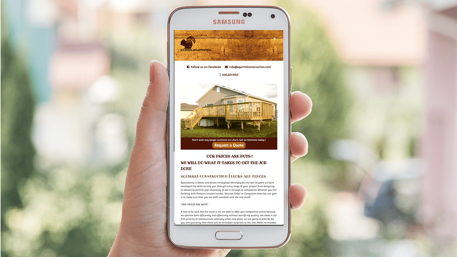
Squirrel Construction was built just for that reason, to provide an information resource for potential clients as well as to act as a lead generation tool to increase business by extending the work
As you can see in the attached mockup, Squirrel Construction’s website is simple, clean, and straightforward. With that said, it provides potential clients with exactly the information they are looking for. There are elements of branding, a personal message from the owner, a gallery of past projects, as well as an opportunity for clients to provide feedback.

The site is straight forward and styled in a way that reflects the image of the owner. Moreover, it is accessible on any platform. Simply put, the site does exactly what the client needs it to do. Sometimes having something basic is all you need to improve your presence online.

by Grant Sharp | Apr 23, 2016 | Blog, Web
A review of Different Online Store Development Platforms
Prior to working on a client’s e-commerce site migration. I did some research to determine which platform would work the best for their business. In this post, I am going to review some of the most commonly used platforms for building a new e-commerce site or web shop.
The truth is that each e-commerce platform has some strengths and weaknesses. All of the platforms offer hosting packages and are very customizable. Depending on which hosting package you choose, they will also allow you to build and maintain your own blog. All of the platforms come with plenty of mobile friendly themes, Social media integration, etc.
Here are the highlights:
Shopify
Shopify is considered by many developers to be the GOLD standard for creating an online store. This is what they do and they do it well. Shopify boasts integration capabilities with more payment processing compatibility options than both WIX and Volusion combined. They have a robust app store and flexible monthly packages that will allow you to customize your shop in almost any way you want.
Without getting too technical, Shopify will allow web designers to “Drop in” bits of custom HTML code at almost any point on your site. This can allow for flexibility when attempting to develop your site’s appearance.
There is also great documentation and support for Shopify, so much that most questions can be answered through navigating the online manual.
There are plenty of developers working on Apps and themes for Shopify. This allows for more themes and apps being available.
Having said that, the fact that Shopify is the leader in online stores has led to them providing most of your store’s functionality themselves. This does have some advantages. Primarily you can be assured that when you purchase additional functionality from Shopify, it will integrate with your site hassle-free.
The challenge with this is that all your functionality is monetized by Shopify. As an example, if you want to redeem gift cards on Shopify, you will need to enroll in the $79 / month plan. Whereas if you use Wix, you are able to start with a lower monthly hosting plan and integrate a 3rd party for $5 /month.
WIX
Wix is a great platform for DIY website builders or designers who hate code. It boasts that it powers over 63 million websites worldwide. Many of these are small businesses and others are blogs, there are also many Online Shops.
The primary advantage to using WIX is that there is literally no coding at all. Everything is done via point and click. The load times on the server are very fast and most themes are mobile friendly with many storefront options to choose from.
The main drawback in using WIX for your shop would be a lack of flexibility in terms of customizing your design. Essentially you will be limited to what Appstore will allow you to add or buy or drop in with the Wix editor.
Another consideration with WIX is that it uses a lot AJAX based in page coding to serve its pages. This isn’t a problem per say as it is what allows designers to use click and drag features in the editor. In the past, there were some SEO concerns, but Wix has gone to great lengths to satisfy them.
The only real concern you might have is the individual URLs end up a bit funky. (lot’s of hashtags and question marks.)
Volusion
Volusion tends to be the most expensive of the bunch, the mini-package at $15 / month is well priced, but there are some restrictions
Another major drawback for Volusion is the price of their templates. Volusion is a lot more expensive. For example, the most expensive Shopify template (or theme) retails at $130. All of the platforms we will discuss offer support, but phone support is only available with Volusion starting at $35 per month. Moreover, the Shopify offers 24 /7 support on all of their packages.
How does it measure up?
Transaction fees are pretty standard across the board, Wix, Shopify and Volusion all have no additional transaction fees beyond the standard 2- 3% for processing through a 3rd party gateway, aka PayPal, etc.
Volusion tends to encourage customers to use their in-house merchant software. This will require application and approval. The advantage would be a more streamlined process for your customers to complete transactions online.
The downside is that you may be limited to what Volusion has to offer. One nice thing I did like about Volusion is the ability to integrate with Amazon & Ebay. This could potentially add to your site’s visibility, and increase traffic though honestly, it needs more exploring.
CSE integration seems to be a strong point of emphasis for Volusion though there is little documentation on their site for this and many of their other features. The recurring theme with Volusion is that they want you to call them rather than engage their resources to provide support.
The AppStore for Volusion is full of many helpful premium apps, most of which cost $10 – $30 / month to use. In total there are only 13 free apps on Volusion; comparatively, Wix has over 100 “free apps” and Shopify has almost 500. In addition, the premium app pricing is significantly lower on both WIX and Shopify ranging from $2 – $30 /month.
WordPress
One platform that we have yet to mention is WordPress. WordPress is still the preferred platform for many developers and has countless free and premium themes to choose from. The leading E-commerce solution on WordPress is Woocommerce, which has several plugins and is a viable alternative to Shopify and Volusion.
Another benefit to WordPress is that many of the add-ons are free or have an annual or one-time fee attached to them rather than a recurring monthly charge. This helps lower your monthly site maintenance fees.
The main drawback with WordPress is that many themes aren’t perfect “out of the box” and it is sometimes more difficult to find a theme that does everything you need and looks great. This often means using “shortcodes” or “hackarounds” and the integration of many third party apps which can sometimes lead to compatibility issues.
Summary and additional considerations for the Online Store Development Platforms
In summary, all of these platforms have advantages and disadvantages. Shopify clearly is the industry leader and will provide the most functionality and highest level of compatibility across different apps.
Building a New Online Store with Shopify should be easy, but you will pay a premium to host it if you want to take advantage of their enhanced features.
The alternatives
WIX is by far the best solution for the Do-it-yourself business owner or designer who does not know any code. Their platform is reliable and they offer several in-house solutions at a reasonable price to allow your online shop to have full functionality.
The primary drawback with Wix is your inability to fully customize your site beyond what is available either in the AppStore or in the Wix site editor.
Volusion appears to be ideal for larger scale merchants with limited Development experience. These are business owners who are looking to outsource the build of their online shop. Accordingly, most of their pricing is incomplete.
Personally, I believe that building a site on their platform will get expensive really quickly. The end product will be reliable, high quality and very customizable, but you do not have the developer base or availability of 3rd party apps.
What we used
In our client’s case, we chose to move ahead with a WordPress and the results were stunning. Keeping that in mind, Wordpress may or may not be a solution depending on your client’s needs. Although WordPress is highly customizable, has a large developer base, and many compatible payment gateways.
However, there are always challenges. WordPress is not always “plug and play” friendly. This means the development process can sometimes take a bit longer in order to ensure that all aspects of the site work properly.
In the end, each development platform has something unique to offer. Each platform is scalable and each platform can be adapted to fit most situations depending on your budget.

